FRUITEAO
Client
Fruiteao
Project
3D Visualization
Branding
Motion Design
Photography
Field
Food
Year
2020
Team
Jaeyel In
Dina Tsyuy
Fruiteao is originally named “C&L Tea House” which has already operated since 2009.
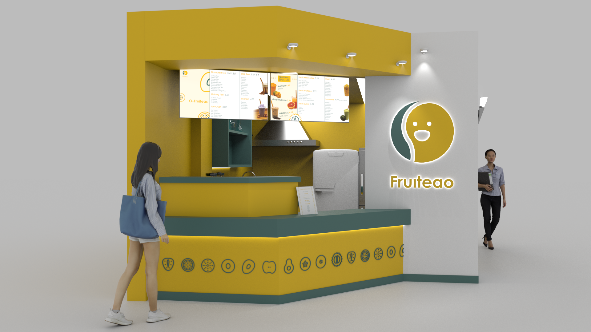
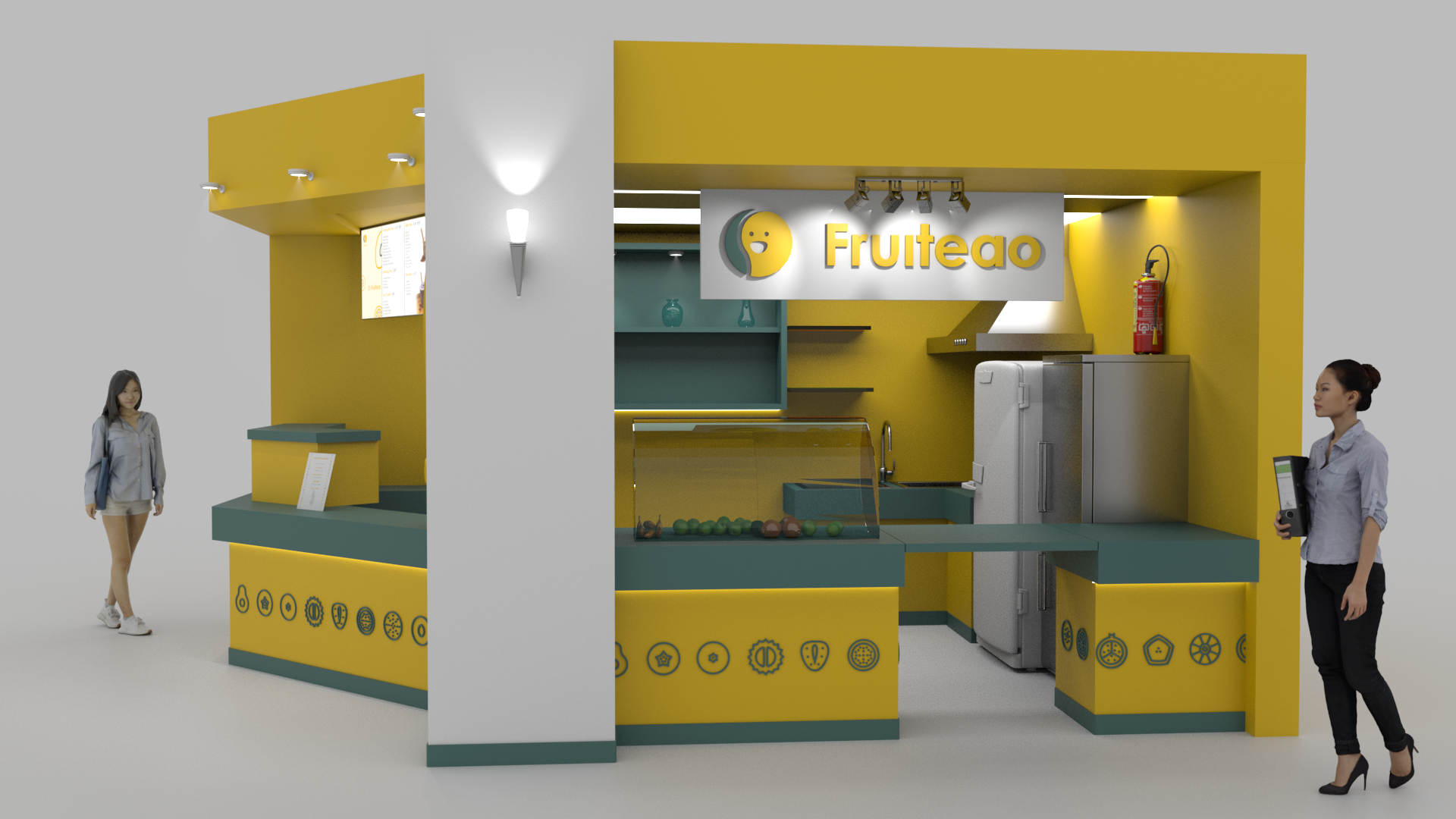
It is located on 109 McCaul St, Toronto, at The Village by the Grange food court. It is a very busy place during meal times, filled with OCAD students, office workers and anyone else who pass by to grab food or even to have a seat for resting.
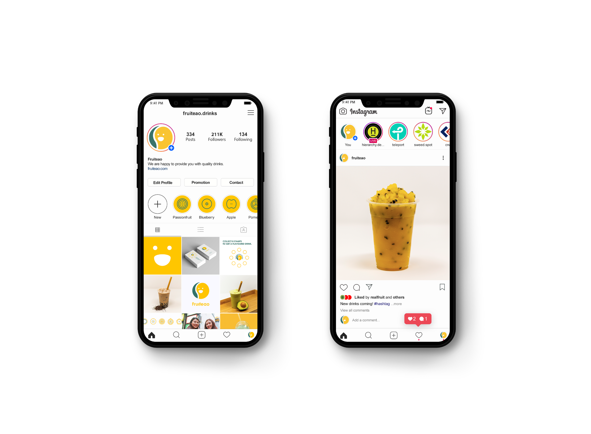
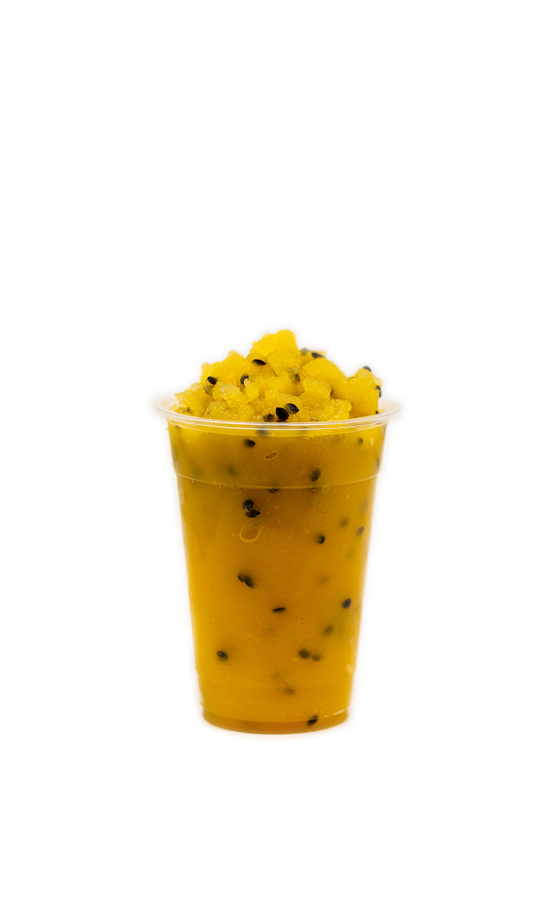
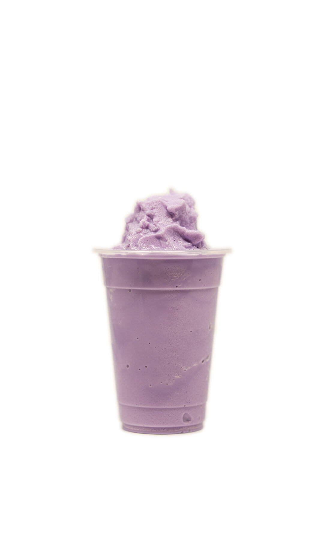
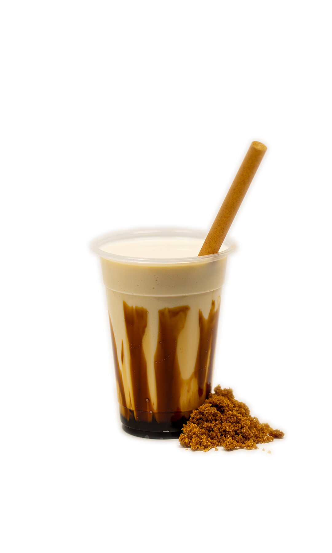
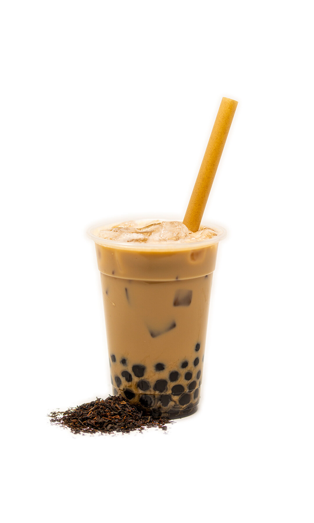
Fruiteao, have provided customers with a variety of beverage choices, such as fresh fruit teas, juices, slushes, smoothies, and milk teas. Using high-quality loose leaves, fresh fruits, and other ingredients to create innovative drinks for customers. Except for the traditional flavoured bubble tea, they are more specialized in fruit teas which are made out of fresh fruits and brewed loose leaves to bring more vitamins and fiber to human body. As well as to juices, smoothies, and slushes are all blended with fresh fruits, so that our customers have more healthy choices.
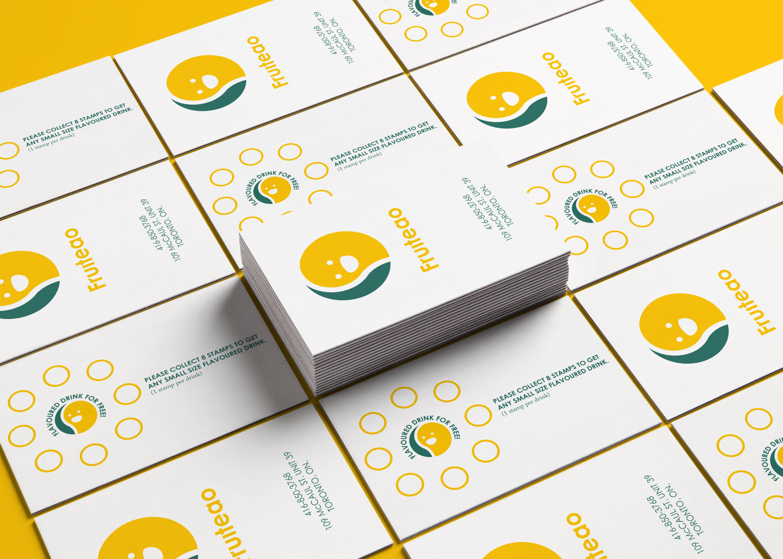
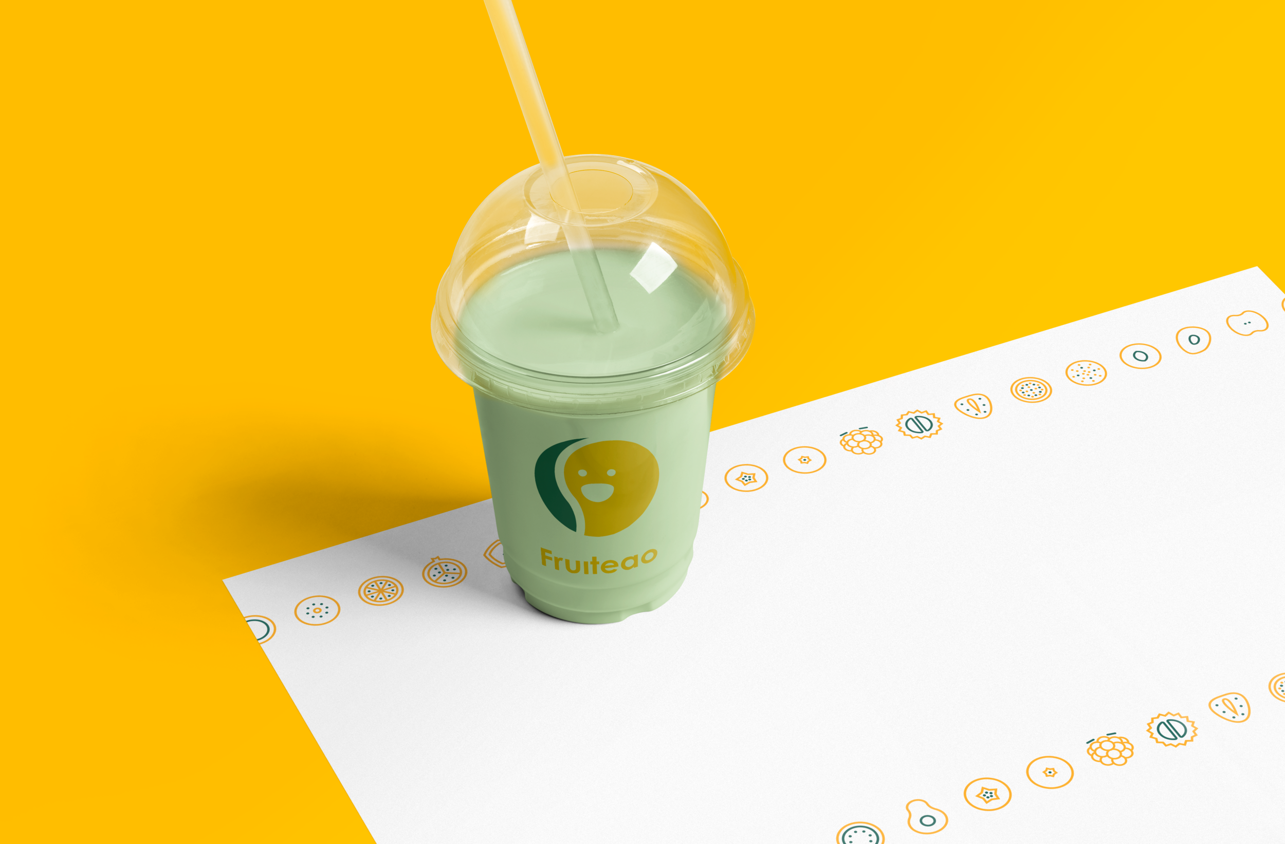
Therefore, Hierarchy has designed the new brand identity for Fruiteao that introduces the combination mark which helps the brand to have a unique icon for its brand. The brandmark is in a circular form that combines the leaf to represent as tea and the mango represent as fruits. As together it means fruit teas. In addition, on top there is the happy face to represent a symbol of happiness and healthy. As the use of colour, it is used by green and yellow to complete the logo. The reason is same as the brandmark that the green is the leaf and the yellow is the mango. Therefore, together represents as fruit teas.
